Demo Video
Results
Machine Learning Results
The machine learning model used in our system is described in detail in section 2.3.1. The average accuracy of the voting ensemble classifier is about 80%. The system diagram of the machine learning process is shown below.
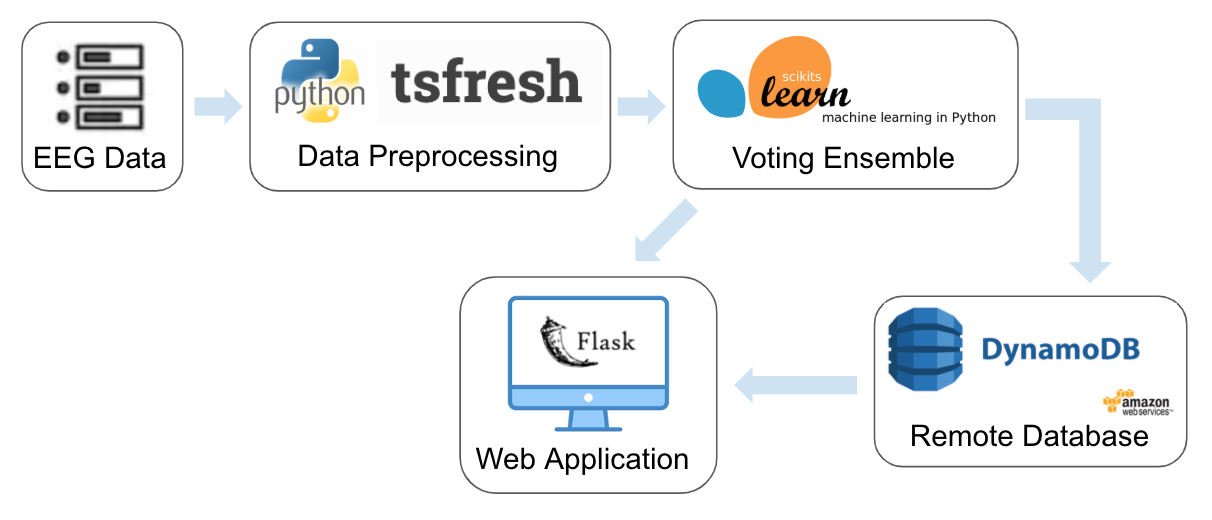
In the real-time prediction process, we first collect 40 seconds (5 sequences * 8 seconds/sequence) of valid data from the user (data with missing values or zeros is discarded during the collection process). The data is then processed and passed to the voting ensemble. Based on the predicted probabilities of each class, we divide the result into 5 subcategories: very positive, positive, neutral, negative, and very negative. The prediction results, which include both the class labels (positive/negative) and the probabilities for each class, are stored in DynamoDB and used to draw visualization graphs on the web application.
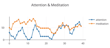
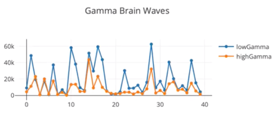
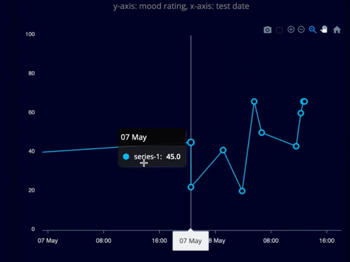
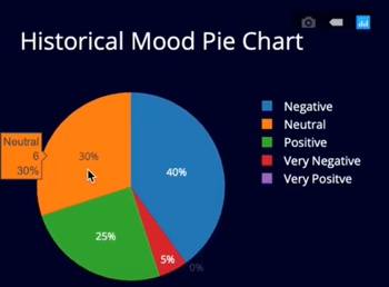
Visualization Results
Plot.ly and ApexCharts are introduced for results visualization. Plot.ly provides online data analytics and visualization tools. ApexCharts is a charting library that helps developers create interactive visualization graphs. Here we us Plot.ly to produce brainwave line chart and historical classification result pie chart for users. ApexCharts is used for producing interactive line chart for historical result tracking with detailed datetime.
|
|
|
|
